One paragraph reviews on art, movies, books, and pop culture by a know-nothing who knows it all

Thursday, April 26, 2007

People Watching

Thomas Struth Heritage 2 St. PetersburgHere's your chance to stare at people and never get caught. At Marian Goodman gallery, Thomas Struth's photographs of museum-goers looking at masterpieces celebrate both the people who love art and those who couldn't care less. It's hard to tear your gaze away from these folks at The Prado and Hermitage museums. My favorite images are the ones that featured teens who are far more interested in checking each other out than any stupid old painting on the wall. As well, I love the photos of overexcited tour guides explaining the masterpieces. (Images via Marian Goodman gallery)

Thomas Struth Museo Del Prado 4
Thomas Struth Museo Del Prado 8-1 8-5

Labels:

Wednesday, April 25, 2007

Photoshopaholics

Clive Owen Lacome ad and Children of Men stillLacome went just a touch overboard when it touched up Clive Owen for its men's fragrance ad. Yes, both these photos are of actor Clive Owen. Known for his rugged, weathered looks, Clive looks unrecognizable in the Lacome print ad. He looks like he's had too many chemical peels and sun-tanning sessions. Keep in mind that the movie still on the right is also retouched. Lacome's photoshopaholics must have worked around the clock to create the plastic C.O. What's the point of Clive being the "new face of Lacome" if you can't even identify his face? (Image via lacome and Film.com)

Labels: ,

Tuesday, April 24, 2007

After the Deluge, Lots of Lipstick

David LaChapelle EstherDavid LaChapelle's surreal photographs at Tony Shafrazi gallery could be interpreted as either a condemnation or a celebration of the U.S.'s materialism and superficiality. Using doomsday imagery, LaChapelle's photos depict people after the floods and hurricanes--and everyone looks glamorous. The camp-factor is pretty high, so the show's theme can't really be taken seriously. These photos poke fun at but also embrace America's cartoon way of life. (Images via Tony Shafrazi gallery)

David LaChapelle Cathedral
David LaChapelle What Was Paradise Is Now Hell

Labels:

Monday, April 23, 2007

Stranger on a (Subway) Train

My jaw dropped when I heard Leonard Lopate on his radio show interviewing Farley Granger. Who knew that he was still alive?? If you live in New York City, you can see the star of a few Hitchcock classics in the flesh tonight, the 23rd. Film Forum is hosting an evening with F.G., which coincides with the publication of his memoir. I always thought Granger's acting was stilted, but I would still go to the Film Forum if I could. Granger lives on the Upper West side, so perhaps I'll see him on the subway some day instead. (Image via AP)

Labels:

Thursday, April 19, 2007

More Blue Canvases

Wei Dong PearHere we go again: more pornographic imagery on your contemporary canvas. Like John Currin and Lisa Yuskavage, Chinese artist Wei Dong dives into "does this shock you" waters. Comparatively, however, Wei Dong's paintings at Stux gallery, which features lots o' bottoms and genitalia, seem chaste. Like his contemporaries, Wei Dong uses the painterly techniques of the old masters. There's a patchwork/collage quality here; none of the figures in these works seem to be in the same painting, almost as though they were crudely photoshopped into the frame. Perhaps, that's the artist's intent. Overall, I'm getting bored with the porn theme.

Wei Dong Pastoral Song

Labels:

Wednesday, April 18, 2007

Small Packages

Patrick Faulhaber Buckaroo Motel Get ready for a wow: the above reproduction is only an inch or so smaller than the original. Patrick Faulhaber's diminutive paintings at Danese gallery are about five to 10 inches wide and three to five inches high. Venturing into Edward Hopper territory of lonely landscapes, most of these works are studies of fluorescent and natural lights. Faulhaber works from photographs and uses a magnifying glass and special eyeglasses to paint these oils on wood. These $20K works are popular; most of these new works had already been sold before the show opened. Would I still be impressed with this show if the paintings were larger? I don't know, but I do know that their size forces you to examine every brushstroke. (Images via Danese gallery)

Patrick Faulhaber Neon Cactus

Labels:

Monday, April 16, 2007

Ikea Never Looked So Good

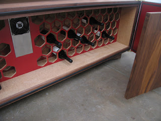
Jorge Pardo lightsJorge Pardo is known for his design aesthetic, but, to me, his show at Friedrich Petzel gallery looked liked a bunch of junk. Walking into the gallery is like entering a super cheap version of Ikea. Lights with fried tendrilled lampshades hang from the ceiling, while wine credenzas line the walls. The lamps I could deal with if I were 18 years old and decorating my dorm room. The wine credenzas, which can hold 100 bottles, were slapped together. I opened a door to one but couldn't close it again. Overall, all the material was cheap crap, and the designs were Urban Outfitters hand-me-downs. I truly don't know if this show was supposed to be funny or not. (Images via Friedrich Petzel gallery)

Jorge Pardo Wine Credenza

Labels:

Flying Colossus

I missed it, but the New York Times caught it: a Richard Serra sculpture flying through the air. Over the weekend, MoMA installed Richard Serra's mammoth steel sculptures in its Sculpture Garden. A crane hoisted the colossi over the wall on 54th Street and into the garden. The museum's Serra retrospective opens June 3. (Image via New York Times)

Labels:

Friday, April 13, 2007

Darkness on the Edge of Town

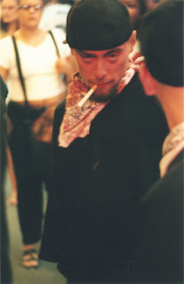
Nan Goldin Colette Modeling in the Beauty Parade photograph"Sad, lonely, desperate." Those are the notes I made after I saw Nan Goldin's early '70s photographs of drag queens at Matthew Marks gallery. Goldin's work has never been considered a picker-upper; still, these 40 black and white images left me feeling drained and empty. People form these subcultures to connect and find joy, but they still can't escape who they are. It's hopeless. All the makeup, all the disguises, all the playacting to un-become yourself, tain't gonna happen. This show is an interesting little time capsule of another time and place, but it certainly won't put a spring in your step. (Images via Matthew Marks gallery)

Nan Goldin Ivy in the Boston Garden photograph
Nan Goldin Ivy with Wigstand

Labels:

Thursday, April 12, 2007

All the World's A Sunny Day

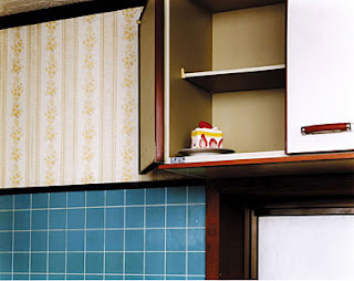
Takashi Yasumura ShortcakephotographTakashi Yasumura's photographs seem a little too set-up for me, but I still enjoyed this exhibit at Yossi Milo gallery. A little Stephen Shore with a dash of William Eggleston, these large images document domestic scenes at Yasumura's parents' middle-class home in Japan. The juxtaposition of objects and clashing colors kept me looking and made me smile, as did the intense Kodachrome-like colors. (Images via Yossi Milo gallery)

Takashi Yasumura A Floor Mat photograph
Takashi Yasumura Loud Speaker photograph

Labels:

Wednesday, April 11, 2007

Drink & Read

Here's a fun little twist: a movie that makes you want to read and get drunk. "Bukowski: Born into This" has the perfect balance between the notoriously inebriated writer's persona and his work. Although I've read Bukowski in the past (he gets an A+ for consistency--or rather, for telling the same story again and again), this documentary made me want to run out and buy more of his books. The almost two-hour film is chock-full of footage of Bukowski reading his poetry in his smooth-gravel voice. I also liked that the filmmakers printed stanzas of his work on the screen during some scenes. (Images via Jeremayakovka and Amadzine)

Labels: , ,

Tuesday, April 10, 2007

Private Exhibitionism

Tanyth Berkeley Untitled #2 Frequency SeriesTanyth Berkeley GraceHo-hum. Another photo exhibit, another freak show. Well, that's what I thought initially when I checked out Tanyth Berkeley's images at Bellwether gallery. Yes, the show spotlights albinos, transgender women, and folks who hang out around 42nd Street. However, after viewing Berkeley's video of hotdogging roller skaters in Central Park, this show's theme hit home: people's fierce drive for individuality, which borders exhibitionism, but at the same time their need for anonymity. (Images via Bellwether Gallery)

Tanyth Berkeley Nikki

Labels:

Monday, April 09, 2007

Slump and Grind

Can't believe that "Grindhouse" came in fourth place this weekend, earning only $12 million. I was one of those moviegoers who spent Easter weekend watching the flick's scenes of dismemberment and car-crash mayhem. This three-hour campy gore fest is a marathon, and perhaps that's why it didn't perform better. Favorite parts: Josh Brolin as a thermometer-chomping doctor; Rose McGowan's machine-gun leg (makes its appearance too far into the film, however); the no-CGI, no special-effects car chase; the bad edits; the "missing reel" segments; and the fake previews of other Grindhouse films. (Images via Moviesonline and MTV)

Labels:

Friday, April 06, 2007

If It Looks Real, It Must Be Fake

Mayumi Terada, Glass door with path
I see a trend. Let's call it "trick realism." The artist recreates an object with such precision that the viewer thinks it's the real thing. Robert Gober's rifle and step stool, Huang Yong Ping's taxidermic animals, Johannes VanDerBeek's bush, Karel Funk's hyperrealistic paintings, and now Mayumi Terada's miniature photography belong to this school I just invented. At first, Terada's black and white photos at Robert Miller Gallery look simply like spartan rooms, but, upon closer examination, you realize that these rooms are dollhouse-proportions. The extra large water droplets on the shower wall and the huge blowing curtain in two images hint that these rooms are miniature sets. Moody--and sometimes even eerie--photos of a world completely self-created.

Mayumi Terada, Shower
Mayumi Terada, Curtain

Labels:

Thursday, April 05, 2007

Right Back at Ya

Karel Funk #21No, these are not photographs. Nor are these ads targeting the hip-hop crowd. These images are acrylic paintings by Karel Funk (love the name) at 303 Gallery. Funk grooves on the way light hits and reflects Gore-Tex material. His subjects are all young men, the majority with only their backs visible, against a white background, . These are the type of paintings that causes the viewer to pause until he's concluded that "Oh, they're not photographs," and then he moves on to the next show. (Images via 303 Gallery)

Karel Funk #12

Labels:

Tuesday, April 03, 2007

Estrogen New Wave

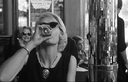
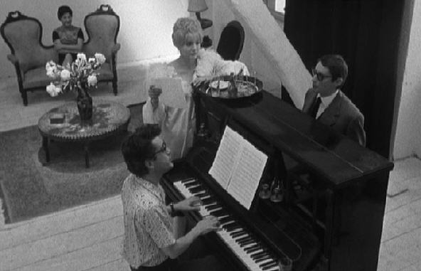
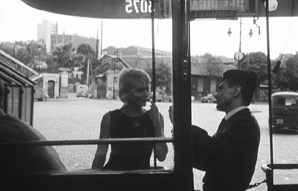
Cleo from 5 to 7, Cleo drinks at cafeI just discovered my new favorite filmmaker: Agnes Varda. If you think the French New Wave of Godard, Malle, and Truffaut is a little too male-centered, Varda and her 1961 flick, "Cleo from 5 to 7," will help to inject a little estrogen into the movement's mix. Still, this film about a pop singer who wanders around Paris as she waits for cancer test results encompasses the best of the New Wave triumvirate. Like Godard, Varda likes the in-between moments of life, like riding in cabs. Like Truffaut, she's cinematically playful, such as when the camera sways back and forth as the characters listen to music. And like Malle, Varda is serious when it comes to issues of life and death.

Cleo from 5 to 7, Cleo and songwriters
Cleo from 5 to 7, Cleo and Antoine

Labels:

Stagy Eden

Justine Kurland Waterfall Mama Babies PaintingThis may be a problem. The farther away the subjects in Justine Kurland's photographs at Mitchell-Innes & Nash the better the image. In other words, in those images in which mothers with their young children are in the foreground, the photos look stagy and the women appear self-conscious. Kurland set out to create an Eden of naked moms and nursing toddlers, but these gardens of earthly delights work best when their inhabitants are less visible. Who knows? Perhaps that was the artist's intent. (Images Mitchell-Innes & Nash)

Justine Kurland The Milk Sucker painting
Justine Kurland Wild Palms painting

Labels:

Monday, April 02, 2007

Details, Details, Details

Johannes Vanderbeek BedJohannes Vanderbeek Ruins Culture PantsIt's all in the details when it comes to Johannes VanDerBeek's exhibit at Zach Feurer Gallery. Entitled "Bed Bush Ruins," the show's four sculptures at first look rather mundane until the viewer steps a little closer and takes a deeper look. Like seeing the Virgin Mary's image in a piece of burnt toast, three wise old faces appear in the stuffing of "Bed." "Ruins" at first seems to be an unknown archeological find, but this tomb is actually made from ground-up magazines. Likewise, don't let the life-sized "Bush" fool you; each leaf is a different painted view of infinite space. The artist's sleight-of-hand is a marvel, but it somewhat overshadows this show's attempt to connect the past, present, and future. (Images via Zach Feuer Gallery)


Johannes Vanderbeek Bush

Labels: